


Any non-trivial application will have some degree of customisation - options the user can select to alter the way the application behaves.
With the more complex applications, it is possible for the preferences dialog to become completely overwhelmed. In this article we will explore some preference dialogs that are great, and some that are not.
ER-Studio
I recently had good reason to use ERStudio 5.5 to look at some documentation for a system I was working upon. One of the diagrams was more than a little complex, so I tried moving some elements around in order to get a better idea about how things were related.
While trying to get the editor to behave itself (which could be a whole other article), I brought up this Options dialog:
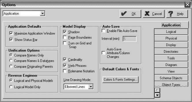
There is a lot to comment on in this dialog.
From a cosmetic perspective, take note of the ‘torn’ border shown for the Object Types tab. I believe that this is trying to provide an affordance that there are more tabs below.
See the combobox in the upper left corner with the text Application? It does the same job as the tabs shown on the right-hand side - allowing the user to select a specific page. Surely, the need to include a widget to bypass the tabs indicates some kind of problem?
However, the real problems here are in the layout and organisation of options.
Consider that the Application tab that is currently visible includes options for Model Display and Default Colors and Fonts. Why are these not on the Display tab? For that matter, what is the different between Display and View? Also, the Reverse Engineer options are related to the logical and physical models, but hasn’t been included on either the Logical or Physical tab.
In short, this dialog suffers from a chronic lack of organisation - probably as a result of evolution over time, with new features in each version being added in here and there instead of under some kind of unified system.
Firefox
The Options dialog in Firefox, by contrast, is a completely different story. Have a look at this screenshot:
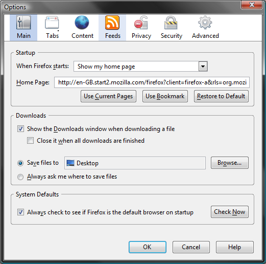
The top level options are all shown - none of them are hidden, none need to be revealed by the user scrolling them into view. Within each pane, the available options are well organised into logical groups. Good use is made of sub-dialogs, brought up by buttons on the various tabs, and used to configure more advanced settings.
Conclusions
Options dialogs in applications are important, and should never be left to grow in a haphazard fashion. They need to be carefully designed, just like the rest of your application.
Comments
blog comments powered by Disqus