In the realm of data compression, one of the fundamental techniques that everyone learns is Huffman coding. The premise of this simple technique is to assign shorter codes for things that are mentioned more frequently, and longer codes for less common things. Another important feature of this technique is that codes are no longer than they have to be - you wouldn’t use a 6 bit symbol if a 2 bit one would suffice.
You can apply the same principle to the user interface of your application - frequent tasks should require the fewest actions ( keystrokes, mouse moves, clicks etc) on the users part.
An Example from Visual Source Safe
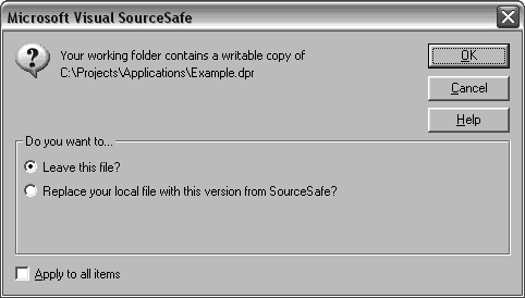
As an example of this premise in action, consider the following dialog snipped from Microsoft Source Safe. VSS is generally an excellent version management tool, but some parts of it’s user interface are sub-par.
In this dialog, the user is being asked to choose an action. VSS is currently copying files out of the repository into the users working directory and has found an existing file that may have been changed by the user. VSS needs to know whether to overwrite the file (with the official copy) or to keep the existing file.

-
If the user wants to leave the file, just one click (on the “OK” button) or one keystroke (return) is required;
-
If the user wants to leave all files, two clicks (checkbox and “OK”). To use the keyboard, six keystrokes (tab, tab, tab, tab, space, enter);
-
To overwrite this file, two clicks (radio button and “OK”) or five keystrokes (tab, tab, tab, down, enter);
-
To overwrite all files, three clicks (radio button, checkbox and “OK”) or seven keystrokes (tab, tab, tab, down, tab, space, enter);
-
To cancel the process, one click (Cancel) or one keystroke (Esc).
Now, none of these seem particular strenuous - yet when you encounter them dozens of times in a single day, the frustration level can be large.
Improving Visual Source Safe
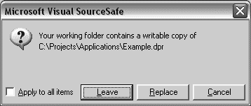
By applying the concept of a Huffman User Interface - where we use shorter sequences of actions for common tasks - we can readily come up with a better alternative.

(This screenshot was doctored in an image editing program as an illustration.)
The differences are that the distinction between different actions has been removed, and that the user no longer needs to confirm the selection (by pressing OK) once the selection has been made.
The dialog is simpler to understand, has fewer GUI elements, and is quicker to use.
-
If the user wants to leave the file, just one click (on “Leave”) or one keystroke (enter) is required;
-
If the user want to leave all files, just two clicks (on the checkbox and “Leave”) or three keystrokes (Alt, A, keep holding Alt, L);
-
To overwrite this file, one click (on “Replace”) or two keystrokes (Alt, R);
-
To overwrite all files, two clicks (on the checkbox and “Replace”) or three keystrokes (Alt, A, keep holding Alt, R).
-
To cancel the process, one click (Cancel) or one keystroke (Esc);
Another Example from Visual Source Safe
What is really frustrating about Visual Source Safe is the lack of consistency in the dialog design.
Consider this dialog, prompting the user to see if a new directory should be created.

From a Huffman perspective it works very well - as any choice the user wants can be made with one click (or two keystrokes). In fact, it meets the guidelines I gave earlier very well.
Yet all those buttons look untidy - and it violates a distinct but related concept:
High impact actions should take more effort than low impact ones.
In this dialog it’s as easy to decline creating all directories as it is to decline just one. For this situation the difference is fairly trivial, as the consequences of pressing the wrong button are not catastrophic - but in other circumstances it can be easy to do a lot of damage.
Perhaps a better approach (yes, I’m hard to satisfy) would be something like this:

Conclusion
While the concept of Huffman coding originates from the field of data compression, the ideas can be usefully applied to user interface design, leading to applications that are easier to use.
By applying the related precept that actions with a higher impact should take more effort, we can also make our applications safer to use.


