


The careful use of colour – of hue, saturation and lightness – can improve a user interface greatly. Sometimes the best use is to avoid distraction, allowing people to concentrate on differences that matter; sometimes the best use is to add information, revealing differences that were previously hidden. Mark Miller (of DotNetRocks and DevExpress fame) spends a lot of time focussing on this area, treating it (rightly, in my opinion) as a competitive advantage.
In his post “Great UI: Clarity and Color on the Presentation Layer”, Mark attempts to convey the experience of impaired colour vision to those with normal vision.
Unfortunately, the conclusions he draws don’t work for at least one person: me.
In simplest terms, my sensitivity to red light is lower than for those with normal vision. This doesn’t mean I can’t see red light – I can. It just means that even the brightest of reds is, in my eyes, darker than the equivalent blues and greens.
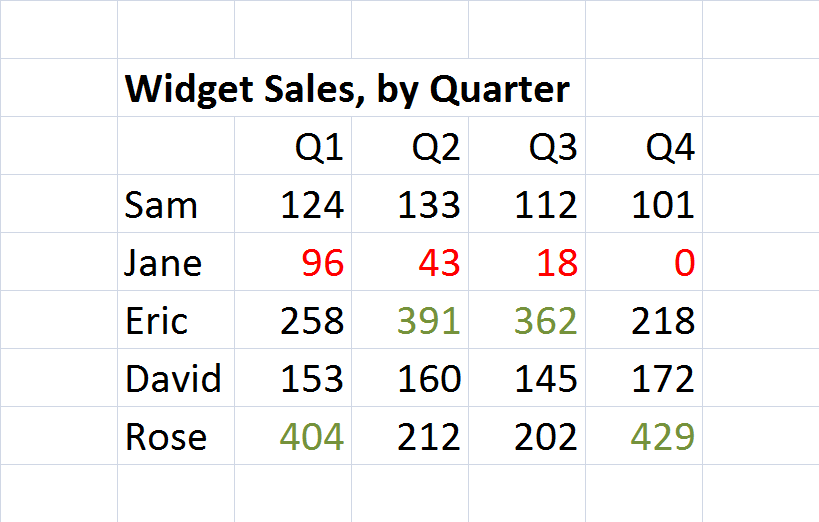
Marks demo revolves around a table of Widget Sales, By Quarter. Here’s my recreation of that table:
Problem is, given my reduced (but non-zero) sensitivity to red, the way it looks to me is more like this (simulated):
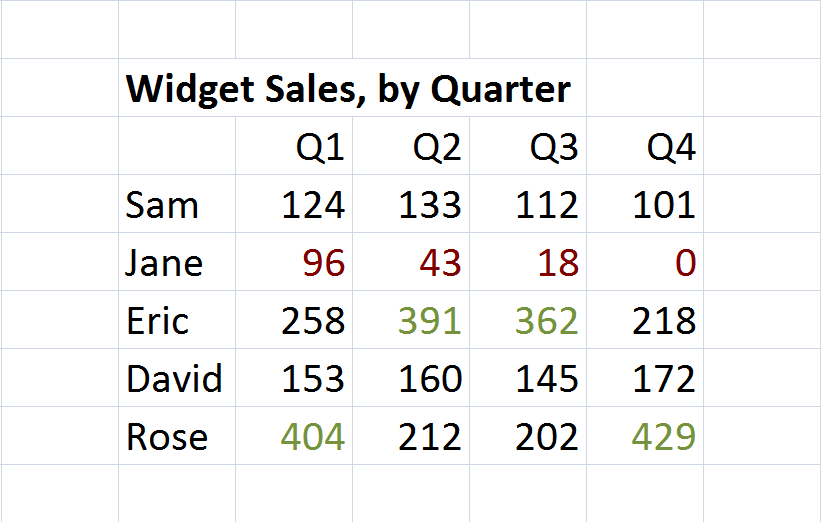
Can you see the difference between the red cells and the black? How much effort does it take?
While the difference between red and green remains high, the visual distinction between red and black is low. It is difficult for me to quickly identify which cells correspond to lower performance.
The answer is not to abandon the use of colour for conveying information. I used to work for a data visualisation company – the accurate representation of information with colour (even to those with impaired colour vision) was the entire purpose of the software product we sold.
The answer is to be careful in our choices of colours, and to use more than just colour. This can be done in many ways.
For example, we could bold any figures that are at an extreme, using colour difference to identify the high and the low:
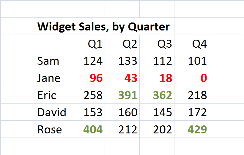
This uses distinction in shape to draw the attention; it also provides larger areas of colour, aiding in recognition.
Or, we could use the same hue as a background tint:
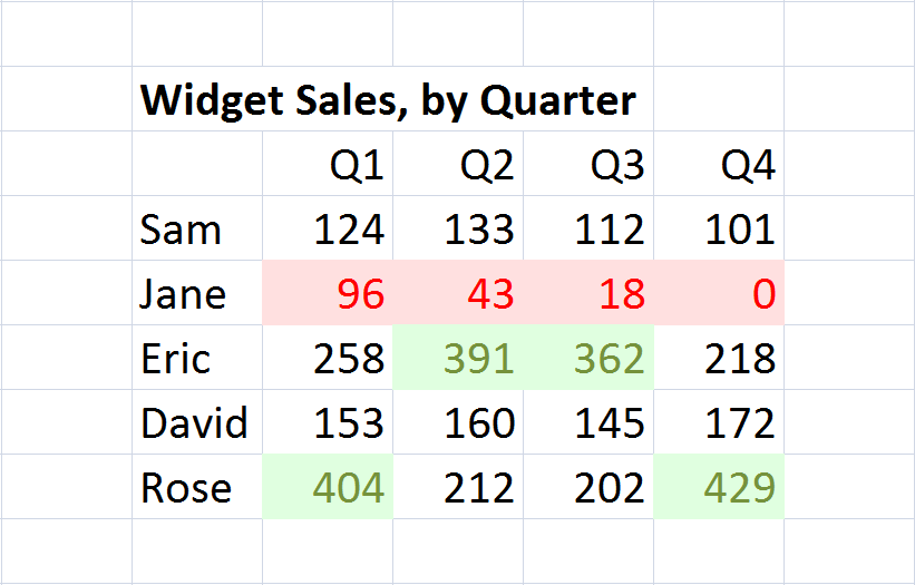
The key here is that vision is non-linear. Depending on the vision defect, people may have trouble telling dark colours apart, or telling light colours apart – but they are unlikely to have problems with both.
If you’re interested in using colour in your UI intelligently, I’d encourage you to go and read Marks blog and to watch his Science of a Great User Experience series on DotNetRocksTV (Part 1, Part 2).
Just, please, pay attention to your Hues!
Comments
blog comments powered by Disqus