I took the plunge last weekend and installed Windows 7 on my primary home machine. Slightly risky, but I figured since it was good enough for many others, it wasn’t too big a risk.
Basically, Windows 7 feels like Windows Vista, but polished. It’s all the little things that make a difference.
One of the big differences, though, is the revamp of the taskbar - while you can change it if you choose, the default presentation is icon based, not named.
I like it - a lot.
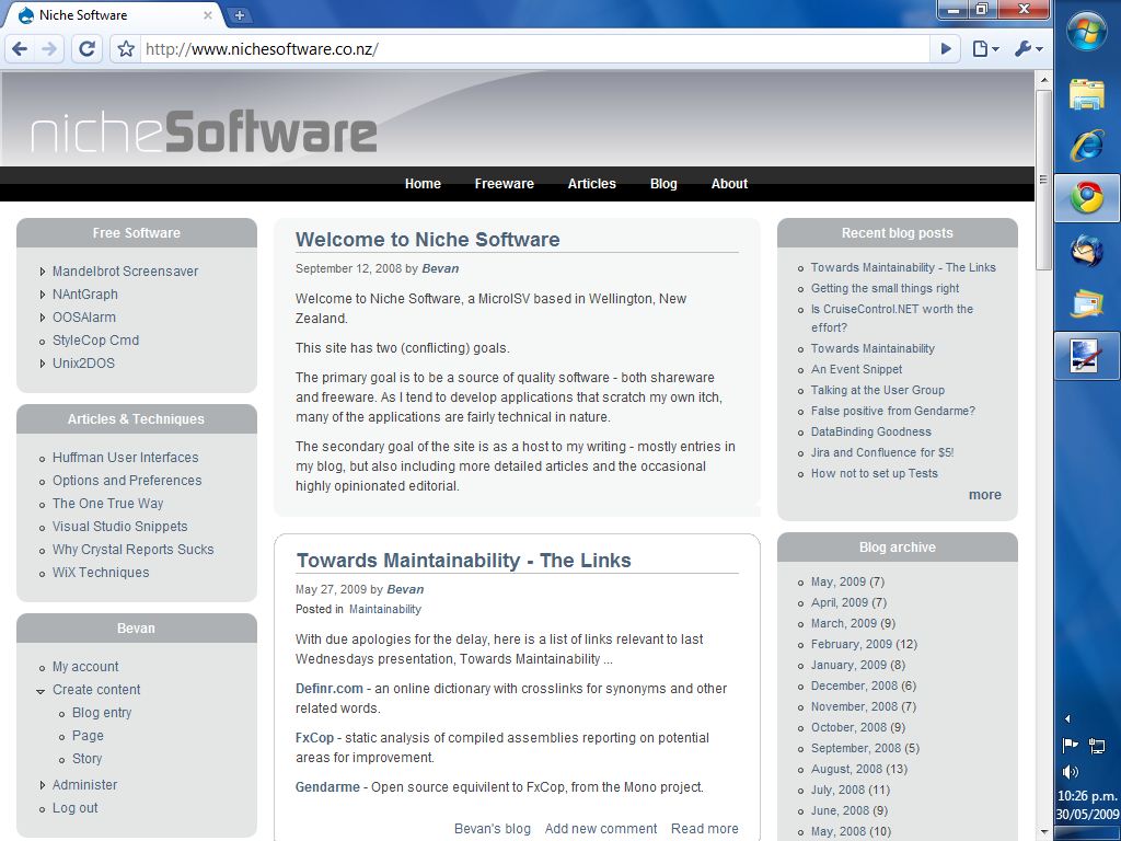
One trick I keep returning too (especially on a wide screen display) is to have the taskbar running vertically down the righthand side of the screen. (This is particularly useful if you run a dual monitor setup, as the bar can run up the middle of the two screens and be conveniently available no matter where your mouse might be.)
Under Vista and XP, doing this required the taskbar to be particularly wide, and if you ever overflowed with too many icons, the result was a disaster.
With the new Windows 7 taskbar, things run much better - and the icon based view means that I don’t need to waste the screen real estate with a wide bar that’s only occasionally needed.
Check out this screenshot for the idea - though note that this is just 1024x768, compared to the dual 1280x1024 I usually run …

Even better, the position of the taskbar is a per-user setting, not a global one - so I can try out this kind of weirdity without requiring my wife to adopt the same kind of configuration.


