


Here’s an example of simple user experience design gone wrong, courtesy of the product registration wizard from Logitech.
Check out the first page of the registration wizard:
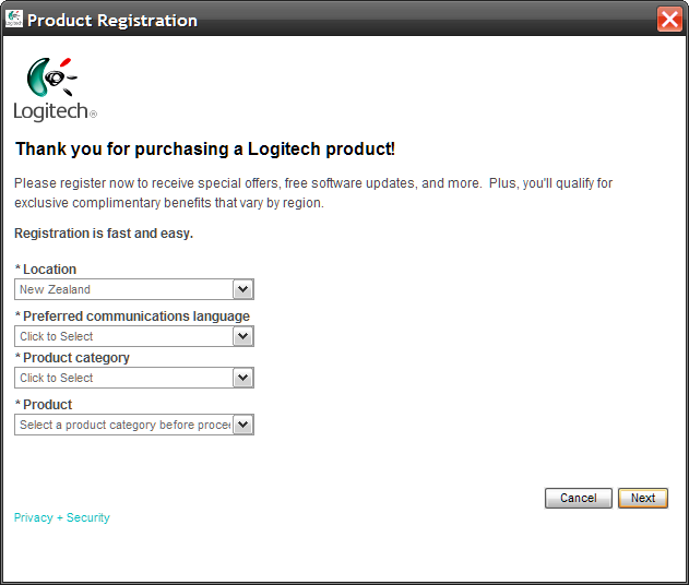
Looks great, doesn’t it - smooth, stylish. Clearly not the work of a developer.
But look at the language choices available:
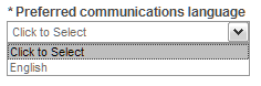
Sure, the list is customized based on my location - but why didn’t they finish the job? If there’s only one choice, why not automatically select it?
For that matter, if there are multiple choices, but one is by far the most common, why not automatically select the most common option, and allow the user to change it if required? This would reduce the effort for most customers, increasing the number who actually bother to complete the registration process.
If you’re a software developer reading this: If you can reduce the amount of effort required of your users, you should reduce it. Your users might even thank you.