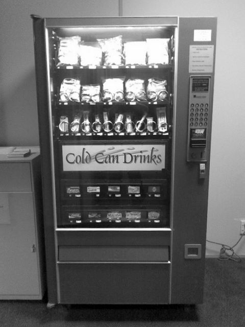
Here’s a vending machine that receives far too many of the coins out of my pocket.

This vending machine has a problem.
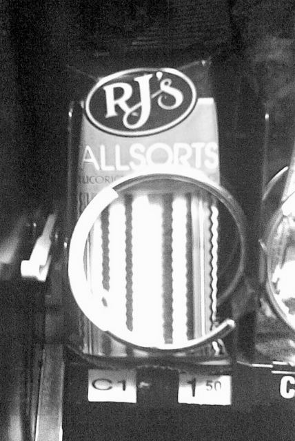
When someone wants to purchase some Hershey’s chocolate, they end up with liquorice instead.


I’ve seen this happen at least four times - not counting the one time it happened to me!
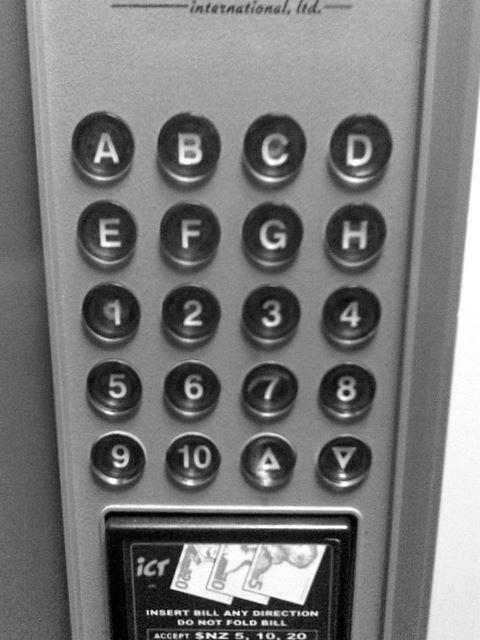
Do you see why? Perhaps a picture of the control panel will help you out.

The chocolate is in the tenth bay, so you need to select D10 to purchase the chocolate. Naturally, people go to press
three buttons: D 1 0.
But, as soon as they press the second button, here comes the liquorice.
Have another look at the control panel - see the extra 10 button. That’s what you are supposed to press.
And there’s the problem: We are surrounded by keypads and keyboards that have the digits 0 to 9 on them. We see
keyboards, phones (corded, cordless and mobile), intercoms and security panels every day and not one of them has a 10
key. Thus, when a gizmo does have a 10 key, no-one is expecting it and almost no-one will use it until
afterthey’ve bought liquorice.
The Lesson: When designing user interaction, we need to take into account the users expectations and do them in a way that seems natural. This is known as the Principle of least surprise.
The Fix: The vending machine doesn’t need to label the last column as 10. Instead, use another symbol, not a
letter or a number - some unique symbol that matches the extra button. No confusion, no errant purchases, no surprise.


