It’s very common for us developers to put our needs ahead of the needs of our users. Often this manifests in the way we build our user experiences, choosing an approach that is easy to implement instead of another that might be easier to use.
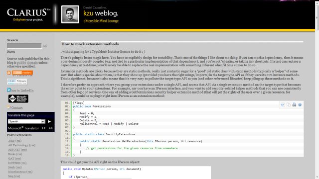
This happens in other areas as well, for other reasons. Check out this screenshot of a blog I found through a Twitter link today:

While I’m sure a professional web page designer would find things to critique, to me this looks like a well designed page. It certainly seems as though it will be easy to read.
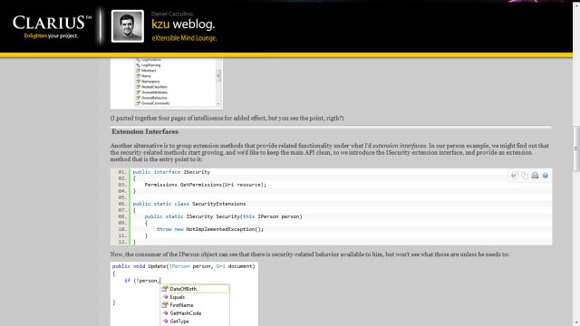
Until I scroll …

Oh dear. The page header stays in place. A full 10% of my screen real estate isn’t available for me to use.
I’m already dealing with a catastrophically small screen, with just 29% of the space I’m used to (being used to working with dual 1680x1050 panels), and now I have to sacrifice 10% of what’s left to see Daniel’s face and a cheesy slogan?
The problem here is that my experience as a reader has been sacrificed on the alter of Daniel’s ego -
Now I can’t change his page design - but I can go somewhere else.
The lesson is simple: It doesn’t matter whether you’re talking about a blog, a web application or regular software, if you put your users experience last, your users will go elsewhere.
Or, to put it more positively: Put your users first - craft a first class experience for them - and they’ll stick with you.


