


While the new shiny web development features of the latest version of .NET are attractive, it’s also important to keep track of improvements in other areas - like WPF. After all, not all development is web based - not even all of the greenfield projects. Some of it is based on rich clients, such as those you’d write in WPF or Windows Forms.
One of these areas of improvement is in the area of WPF controls - did you know that .NET now includes a capable Ribbon control? Once the province of third party control vendors, there’s now a native .NET ribbon that comes out of the box. I’ve used this on a couple of personal projects and found there to be a regrettably low level of documentation.
Aside - at work, I’ve made regular use of the excellent Developer Express WPF Ribbon Control so my experience with the native ribbon control is somewhat limited - but here’s how to get up and running. (If you’ve used the control before and you’re familiar with the basics, you might want to skip to the tips listed at the end of this blog to see if there’s anything you haven’t seen before.)
Getting Started
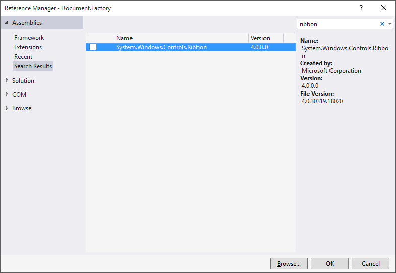
To begin, add a reference to the assembly System.Windows.Controls.Ribbon:
With this reference, you don’t need to add any special namespaces to your XAML; the new ribbon controls are automatically in scope. For the main window of your application, switching to a <RibbonWindow> results in a cleaner integration:
<RibbonWindow x:Class="MainWindow"
              xmlns="http://schemas.microsoft.com/winfx/2006/xaml/presentation"
              xmlns:x="http://schemas.microsoft.com/winfx/2006/xaml"
              Title="Main Window"
              Height="350"
              Width="525">
...
</RibbonWindow>
Remember that you’ll need to change the ancestor in the C# declaration as well:
public partial class MainWindow : RibbonWindow
{
    // ...
}
To create the ribbon itself, add a <Ribbon> element. I typically nest this within a regular <Grid> to control the layout in a fairly typically WPF manner:
<Grid>
    <Grid.RowDefinitions>
        <RowDefinition Height="Auto" />
        <RowDefinition Height="*" />
    </Grid.RowDefinitions>
    <Grid.ColumnDefinitions>
        <ColumnDefinition Width="*" />
    </Grid.ColumnDefinitions>
    <Ribbon Grid.Row="0"
            Grid.Column="0">
...
    </Ribbon>
</Grid>
Basic Layout
The most recognisable feature of the ribbon is the set of tabs, groups and buttons that provide easy access to application functionality. The <Ribbon> control makes this very easy to set up, with a set of available elements such as <RibbonTab>, <RibbonGroup> and <RibbonButton> that are relatively easy to configure.
For example, here’s a simple ribbon, following by the markup required to create it:
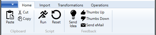
<RibbonTab Header="Home">
    <RibbonGroup Header="Clipboard">
        <RibbonButton Label="Paste"
                      LargeImageSource="Resources/paste-32.png"
                      SmallImageSource="Resources/paste-16.png" />
        <RibbonButton Label="Cut"
                      SmallImageSource="Resources/cut-16.png">
        </RibbonButton>
        <RibbonButton Label="Copy"
                      SmallImageSource="Resources/copy-16.png">
        </RibbonButton>
    </RibbonGroup>
    <RibbonGroup Header="Script">
        <RibbonButton Label="Run"
                      LargeImageSource="Resources/run-32.png"
                      SmallImageSource="Resources/run-16.png" />
        <RibbonButton Label="Reset"
                      LargeImageSource="Resources/reset-32.png"
                      SmallImageSource="Resources/reset-16.png" />

    </RibbonGroup>
    <RibbonGroup Header="Feedback">
        <RibbonButton Label="Send Idea"
                      LargeImageSource="Resources/idea-32.png"
                      SmallImageSource="Resources/idea-16.png" />
        <RibbonButton Label="Thumbs Up"
                      SmallImageSource="Resources/thumbup-16.png" />
        <RibbonButton Label="Thumbs Down"
                      SmallImageSource="Resources/thumbdown-16.png" />
        <RibbonButton Label="Send eMail"
                      SmallImageSource="Resources/mail-16.png" />

    </RibbonGroup>
</RibbonTab>
Tip: Always supply a small icon
The default size of the button is controlled by which images you supply - if you supply a large image, you get a large button; if you supply a small image (and no large image), you get a small button.
One of the fundamental behaviours of the ribbon is the way it adapts to the window size, meaning that even your large buttons should have small icon, to allow for when the window is reduced in width.
The small icon is also used if/when the button is pinned to the quick access toolbar.
Tip: Aligning labels
If you use the Label property on the RibbonTextBox, it will automatically show a caption next to the textbox. Very useful and convenient, but if you have more than one you’ll notice the text fields do not align unless your labels are coincidentally the same length.
You can get the labels and fields to align cleanly - as shown here:
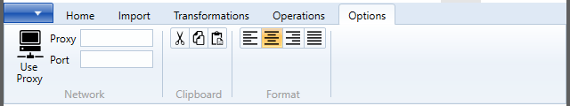
To achieve this, the simplest method I’ve found is to use a nested grid:
<RibbonGroup Header="Network">
    <RibbonToggleButton Label="Use Proxy"
                        SmallImageSource="Resources/proxy-16.png"
                        LargeImageSource="Resources/proxy-32.png" />

    <Grid>
        <Grid.RowDefinitions>
            <RowDefinition />
            <RowDefinition />
        </Grid.RowDefinitions>
        <Grid.ColumnDefinitions>
            <ColumnDefinition />
            <ColumnDefinition />
        </Grid.ColumnDefinitions>
        <TextBlock Grid.Row="0"
                   Grid.Column="0"
                   Text="Proxy"
                   VerticalAlignment="Center" />

        <TextBlock Grid.Row="1"
                   Grid.Column="0"
                   Text="Port"
                   VerticalAlignment="Center" />

        <RibbonTextBox Grid.Row="0"
                       Grid.Column="1" />
        <RibbonTextBox Grid.Row="1"
                       Grid.Column="1" />
    </Grid>

</RibbonGroup>
Tip: Related Buttons
To display a group of closely related buttons - such as in the Clipboard group here:
Wrap the buttons themselves in a <RibbonControlGroup> like this:
<RibbonGroup Header="Clipboard">
    <RibbonControlGroup>
        <RibbonButton SmallImageSource="Resources/cut-16.png" />
        <RibbonButton SmallImageSource="Resources/copy-16.png" />
        <RibbonButton SmallImageSource="Resources/paste-16.png" />
    </RibbonControlGroup>
</RibbonGroup>
Tip: Radio Buttons
If you have a set of mutually exclusive options, such as in the Format group shown above, you can set these up using <RibbonRadioButton> and nesting within a <RibbonControlGroup>.
<RibbonGroup Header="Format">
    <RibbonControlGroup>
        <RibbonRadioButton SmallImageSource="Resources/align-left-16.png" />
        <RibbonRadioButton SmallImageSource="Resources/align-center-16.png" />
        <RibbonRadioButton SmallImageSource="Resources/align-right-16.png" />
        <RibbonRadioButton SmallImageSource="Resources/align-justify-16.png" />
    </RibbonControlGroup>
</RibbonGroup>
Conclusion
The .Net framework now contains a capable Ribbon control for WPF, allowing clients to be built in this style right out of the box without any third party dependencies.
(All icons shown in screenshots are from SyncFusion MetroStudio.)