


Why is it that most developers use a monospaced font for their code?
The first monospaced typefaces were developed for early typewriters, where mechanical limitations required the paper carriage to move by a constant increment for each character typed. Much later, the first electronic descendants of those manual devices continued to use the same simple mechanisms.
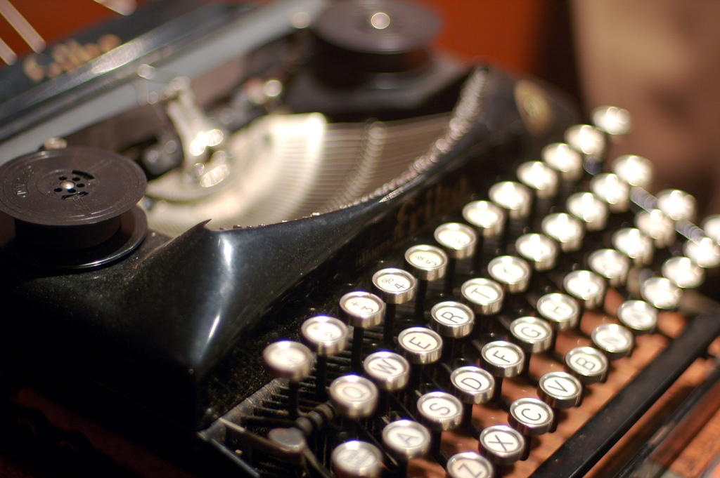
Early developers worked with punched cards, committing character to separate column - monospaced printouts made it easier to review the results of execution and to make changes, especially when certain operations had to appear in particular columns.
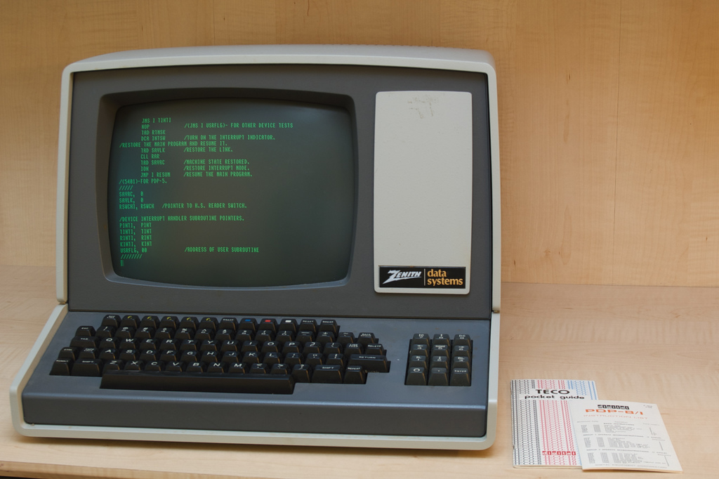
Backward compatibility lead to the first computer displays retaining the same fixed width display style, leading to an entire generation of online terminals with monospaced displays.
But, in around 1450 when Johannes Gutenberg developed his movable type printing press and revolutionized the publishing industry, his machine used proportional type.
Digital typesetting started in the mid 1970’s and blossomed into a digital publishing revolution when PostScript Type 1 fonts were introduced in 1984. TrueType fonts arrived a couple of years later.
So why are we developers still using monospaced fonts almost 30 years later?
I’m a heretic who uses proportional fonts for programming and has done so for much of the past ten years.
Why?
Proportional fonts are easier to read.
Research into font readability has found that people typically read proportional fonts 10-15% faster than monospaced fonts. It’s conjectured that this is because text printed proportionally is perceived word by word instead of letter by letter. Regardless of the reason, a simple change that makes it easier to read frees up neurons to get things done.
Proportional fonts are horizontally more compact.
Wide screen monitors are fantastic for developers, but even with all those pixesl horizontal space is at a premium - not least when working through three way git merge conflicts. Proportional fonts are typically more compact, keeping more code in view at a time. They also make it possible to work on a portrait screen - 1200x1920 is spectacular when working with legacy code.
Proportional fonts make it easier to spot typos.
Fixed width fonts deprive the human visual system of an important clue - the width of the letter - when transforming a group of shapes on the page into a recognized word. This makes it more difficult to spot any misspelled words.
Have you tried working with a proportional font? Why not give it a go? Good choices to try include Verdana, Tahoma and Segoe UI.