


The application menu is an essential part of the fluent (or ribbon based) user experience. Microsoft’s own ribbon design guidelines for the use of the ribbon make this abundantly clear:
In addition to tabs and groups, ribbons consist of … an Application button, which presents a menu of commands that involve doing something to or with a document or workspace, such as file-related commands.
(Quoted from MSDN.)
Aside: If you haven’t read Microsoft’s design guideslines for use of the Ribbon, I’d thoroughly recommend taking the time to do so - you’ll likely find your thoughts about the structure of ribbon for your application will change as a result. The fluent user interface is much more than a glorified tabbed toolbar, it’s a unified approach to application design.
The usual approach is to create an application menu that handles “whole of document” activities - creation, loading, saving, printing, sharing and so on. This leaves the ribbon itself for the process of document editing. You can see this to some extent in the debut release of the Fluent UX in Office 2007, though it has become much clearer in subsequent releases.
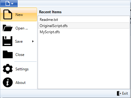
Here is a stereotypical example, showing a fully realized application menu as you can build it with the WPF ribbon control built into .Net 4.5:
To begin, we need the markup for the application menu itself:
<Ribbon>
    <Ribbon.ApplicationMenu>
        <RibbonApplicationMenu SmallImageSource="Resources/new-16-white.png">
            <RibbonApplicationMenuItem ImageSource="Resources/new-32.png"
                                       Header="New" />
            <RibbonApplicationMenuItem ImageSource="Resources/open-32.png"
                                       Header="Open ..." />
            <RibbonApplicationSplitMenuItem ImageSource="Resources/save-32.png"
                                            Header="Save">
                <RibbonApplicationMenuItem ImageSource="Resources/save-as-32.png"
                                           Header="Save As ..." />
                <RibbonApplicationMenuItem ImageSource="Resources/save-as-32.png"
                                           Header="Save a Copy ..." />
            </RibbonApplicationSplitMenuItem>

            <RibbonApplicationMenuItem ImageSource="Resources/close-32.png"
                                       Header="Close" />
            <RibbonSeparator />
            <RibbonApplicationMenuItem ImageSource="Resources/settings-32.png"
                                       Header="Settings" />
            <RibbonApplicationMenuItem ImageSource="Resources/about-32.png"
                                       Header="About" />

        </RibbonApplicationMenu>
    </Ribbon.ApplicationMenu>
</Ribbon>
The menu items themselves are straightforward, though it’s important to note that these are all dedicated
RibbonApplicationMenuItem or RibbonApplicationSplitMenuItem controls, not simple RibbonButtons.
Note especially the split-menuitem used for the Save button - providing easy access to Save, as well as
Save As and Save a Copy in the submenu.
Where the top items relate to the current document, the bottom two are more general, so they’re split off with a dividing
line generated by a RibbonSeparator.
A Ribbon with no Application Menu
If you are sure that omitting the application menu is the right thing for your situation, you’ll find that you can’t do so just by omitting the markup for the menu. You application will show an application menu anyway, albeit one with no content:
Instead, you must create a minimal application menu but mark it with Visibility collapsed:
<Ribbon>
    <Ribbon.ApplicationMenu>
        <RibbonApplicationMenu Visibility="Collapsed"/>
    </Ribbon.ApplicationMenu>

</Ribbon>
The Mysterious “Label” Property
You may notice that the application menu itself has a Label property that might allow you to give a caption
(perhaps “File”) for the menu tab. Unfortunately, it doesn’t work.
As far as I can tell, the menu inherits it’s Label property from an ancestor class, it doesn’t implement it directly, nor does the ribbon use it in rendering. You could go to all the effort of replacing the appropriate XAML template in order to get the label to display - and there are blog posts that show you how - but all in all it doesn’t seem (to me) that the payoff in effort is worthwhile. YMMV.
Footer Pane
The footer of the control is a simple content area, which you can populate as you see fit. Here’s the markup used for the sample shown above - a simple bar with an “Exit” button at the righthand side:
<RibbonApplicationMenu.FooterPaneContent>
    <Grid>
        <Grid.ColumnDefinitions>
            <ColumnDefinition Width="Auto" />
            <ColumnDefinition Width="*" />
            <ColumnDefinition Width="Auto" />
        </Grid.ColumnDefinitions>
        <RibbonButton Label="Exit"
                      Grid.Column="2"
                      SmallImageSource="Resources/exit-16.png" />
    </Grid>
</RibbonApplicationMenu.FooterPaneContent>
Auxiliary Pane
Similarly, the righthand side of the control is another content area, the auxiliary pane. Typically (though not always), the auxiliary pane is used to list recent documents:
<RibbonApplicationMenu.AuxiliaryPaneContent>
    <Grid VerticalAlignment="Stretch"
          HorizontalAlignment="Stretch">
        <Grid.RowDefinitions>
            <RowDefinition Height="Auto" />
            <RowDefinition Height="*" />
        </Grid.RowDefinitions>
        <Border Grid.Row="0">
            <TextBlock Text="Recent Items"
                       FontWeight="Bold"
                       Margin="5" />
        </Border>
        <ListBox Grid.Row="1">
            <ListBox.Items>
                <ListBoxItem Content="Readme.txt" />
                <ListBoxItem Content="OriginalScript.dfs"
                             IsSelected="True" />
                <ListBoxItem Content="MyScript.dfs" />
            </ListBox.Items>
        </ListBox>
    </Grid>
</RibbonApplicationMenu.AuxiliaryPaneContent>
Note that the overall height of the auxiliary pane is controlled by the number of top level menu items.